
Share This Post
Balancing Your Statement with Nature’s Timelessness
Color shapes the way spaces feel. It influences mood, adds complexity, and brings life to materials. Yet, it is often the final—and most challenging—choice in design. Many find it easier to first establish space, shape, and detail in a neutral framework before layering in color. Much like casting actors in a play, colors bring personality and nuance to the stage, creating balance and focus.
Color exists as a delicate interplay of tones, hues, chroma, and intensity—qualities that can be unpredictable and deeply expressive. The right choice can reveal the true character of a material; the wrong one can feel jarring or quickly lose appeal.
Nature’s Palette
In nature, no color feels out of place. Whether vibrant or muted, nature’s combinations always appear harmonious. In a Hawaiian reef, vivid coral, purple urchins, multi-colored fish, and tangerine starfish coexist without hesitation. In contrast, a winter riverbank in the Grand Tetons may offer only quiet grays and browns, save for a single rust-colored leaf. Both scenes feel right within their contexts.
Unlike nature’s ever-changing colors, the finishes and fixtures in a home remain largely static through the years. While clothing may shift seasonally, wall colors, cabinets, and countertops tend to stay the same. This permanence is what makes color selection so daunting: choices must endure beyond passing trends.
In residential spaces, materials and colors that complement the overall design tend to age more gracefully than bold, attention-demanding choices. In commercial spaces, bright, high-energy colors may be appropriate—but in the home, subtlety often serves better.
The CX Pr-Formula Palette
The CX Pro-Formula Palette was developed with this longevity in mind, drawing inspiration from colors found in natural environments—stone-strewn beaches, wave-polished glass, forest floors. Early explorations into concrete coloring revealed that bright pigments, while striking, often clashed with the material’s inherently earthy quality. The most timeless results came from subtle, mineral-based tones that harmonized with the organic nature of concrete.
Concrete’s appeal lies in its mass, texture, and the way light refracts through its sand, fines, and aggregates. Many pigments are naturally occurring—iron oxides, mineral compounds—which reinforce the connection to the earth. The CX Pro-Formula Palette reflects this connection, offering colors that feel grounded and enduring, rather than tied to fleeting fashion.
Color Through Surface Texture
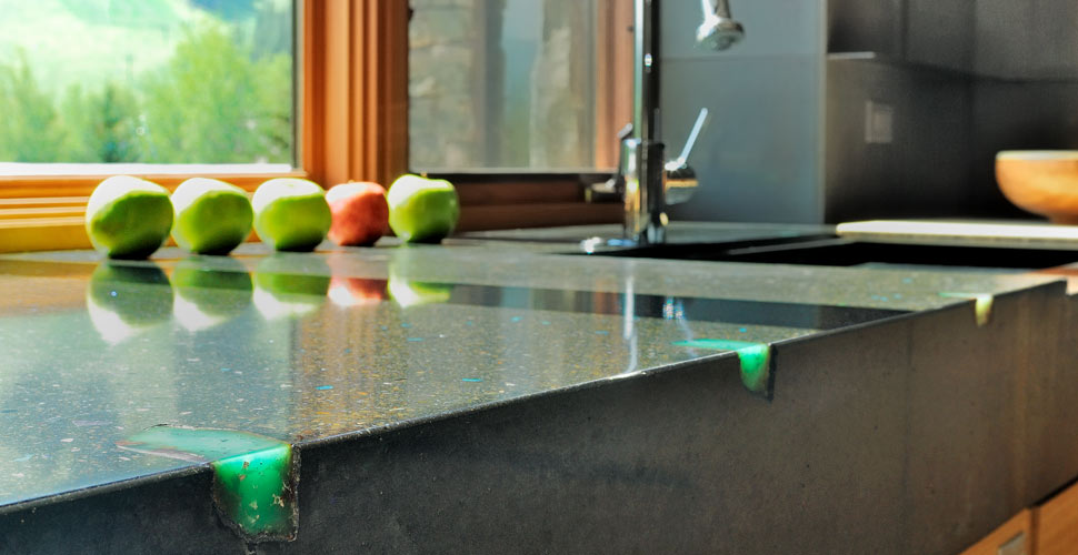
Decorative aggregates, such as turquoise, amazonite, or jadite, can add tasteful accents to concrete surfaces. Used sparingly—sprinkled into molds or broadcast over pour-in-place surfaces—they create variation without appearing uniform or manufactured. This approach avoids imitating synthetic materials and instead embraces a natural randomness.
For those seeking more visual variation, subtle mottling can be introduced by blending concentrated pigment into the base mix and allowing the colors to fuse during vibration. The effect should be organic, avoiding the artificial look of “marbleized” or cultured surfaces.
Matching specific colors exactly in concrete is nearly impossible due to variables like cement source, aggregate composition, and environmental exposure. UV light and weathering will also mute certain pigments over time, particularly ultramarine blue, blue-green, and some organic blacks.
Consider Hierarchy and Self-Expression
Color selection should be made in the context of the overall design. Elements like cabinetry, flooring, backsplashes, and ceilings should all be considered together. Establishing a hierarchy of focus helps: if the countertop is a focal point, surrounding surfaces might be kept neutral to avoid visual competition.
There are no absolute rules for what constitutes “good” or “bad” color. The most successful designs often emerge from a balance between contextual appropriateness and personal expression—choices that feel authentic rather than dictated by trend.
Environmental Responsibility
Certain pigments, including cobalt blue, chromium green, and some acid stains, contain heavy metals that can harm the environment if released into soil or waterways. When working with these materials, take precautions to capture and safely dispose of slurry and runoff from grinding or polishing. Containment can be achieved through evaporation, toxic waste disposal, or by incorporating waste into solid concrete products.
Share This Post