
Share This Post
Balancing Your Statement with Nature’s Timelessness
Color is about visual relationships and what makes our world vibrant. Choosing colors is generally the last and most difficult choice when making design decisions; it’s always easier to work on the space, the plan, the shape, and all the details of a project in a black-and-white world before considering color. It’s like staging a play and then choosing the right actors to bring complexity and subtlety to the characters, giving the play focus and balance reflecting a slice of life. Color is built of layers of tones, hues, chroma, and intensity—all unpredictable, subtle, and complex. It can also reveal character in materials; and some color theorists claim that color can affect mood.
Nature’s Palette
There are no wrong colors in Nature. However brash, bold, extreme or subdued, Nature’s colors always seem right, or appropriate. A brief snorkeling excursion in the tropical waters of Hawaii reveals the broad range and depth of Nature’s palette. From the pink coral and purple urchins to the teeming multi-color banded reef fish and tangerine starfish, there is no hesitation, no restraint.
On the other hand, in the upper valley reaches of the Grand Tetons by a river in the early winter, the colors of the river rock and sand or the bare branches stripped of foliage are often an assortment of subdued, washed-out grays and browns. The only bright color to be found may be a single leaf clinging to a twig displaying the faded red rust of late fall. It all seems—feels—right.
In nature, color follows the seasons and geography. Color is constantly changing in the natural world and, yet, is relatively static in our homes. We alter our dress to accommodate the seasonal weather and fashion dictates of the latest color trends, but we usually don’t change our wall colors to match the seasons, nor do we change the cabinet or countertop colors.
Therefore, our selection of finishes and fixtures for our homes are choices we must live with through all the seasons, year after year. We simply don’t have the luxury of changing finishes and fixtures at the whim of trends. And that is probably what makes color decisions and choices in most aspects of our environment so daunting and fearful—we know we have to live with our choices for a relatively long time.
It’s all about context when it comes to which color choices work and which do not. In a commercial setting, countertops can be flamboyant with flashy colors that excite one’s visual sense. Conversely, in my view, good design in residential construction is about choosing materials and colors that are appropriate (less intense colors) to the overall feeling of the project rather than making selections that are ultimately hard to live with.
Cheng Design Palette
The fear of making the wrong decision can cause paralysis. However, after many years of imposing my decisions (with plenty of trepidation on both sides, I might add) on my clients’ homes, I have learned a few things about what colors seem to work best in our concrete countertops and what materials and colors, in other parts of the kitchen or bath, complement our countertops.
The color palette I’ve developed for our countertop projects as well as for our new NeoMix Pro-Formula product reflects the delicate balance that occurs so effortlessly in nature. This is a range of colors one might find scavenging stones at a beach, or walking the shoreline and happen upon a piece of beach-washed glass, or sifting the bed of a forest floor for numerous natural treasures.
When I first started making countertops I was tempted by all the color possibilities with pigments and white cement. I soon learned that white cement powder didn’t mute the color intensity of the pigments and I naturally wanted to explore the potential freedom of expression with a bright color palette. In fact, a few of my fellow pioneers in concrete countertops were exploring the same avenues and subsequently introduced a great variety of colors in their countertop projects.
But after considerable color exploration, I came to the conclusion that the appeal of concrete as a material was really its earthy quality. What defines “earthy” is obviously quite subjective, but I suspect that it’s something that you know when you see it, feel it and touch it. Consequently, using bright, intense, pastel-like colors with concrete did not seem appropriate to the material itself. It seemed to me that intense colors, although at first spectacular would soon become outdated and wearisome.
What is universally appealing about our concrete countertop surfaces is the subtle, timeless blend of color and texture and the mass of the object: it’s what makes it feel good. Like a natural object, the subtle refraction of light from the sand, fines, and rock in the concrete is what gives it life and depth. The pigments are, for the most part, made from iron oxides (basically rust) or minerals that occur naturally as well. Because concrete is fundamentally from the earth, I decided to create a color palette that worked with the timeless feel of that earthiness. These are colors that won’t go in and out of style with the trendiness of a fashion statement.
Color Through Surface Texture
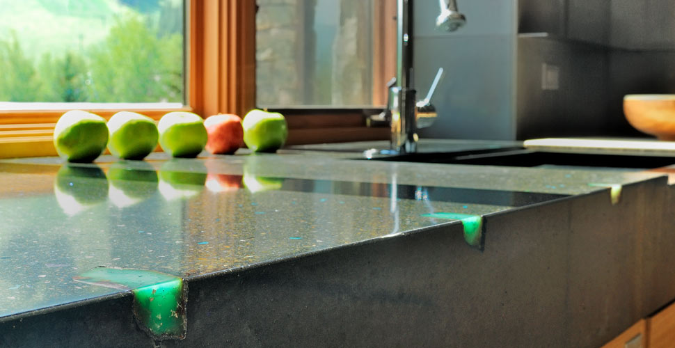
To enhance the presence of nature in our countertop surfaces, I have personally selected and sourced special semi-precious stones (turquoise, amazonite, jadite, and others) that we use as decorative aggregates. They are generally too expensive to seed throughout the mix so we use them sparingly by sprinkling them on the surface of the molds and broadcasting them onto the top surface of site pours. (Note: We’re careful not to uniformly apply the aggregates! We don’t want to mimic imitation granites like Silestone and Zodiaq).
The intense colors of these aggregates can provide a tasteful accent to the more neutral base pigments. I like using aggregates and fines that complement the warm or cool tones of concrete. The variegation produced by exposed aggregates, sand and fines creates an overall effect that is inspired by nature but does not imitate nature.
For those seeking some additional color accents in their countertops, consider creating a mottled or variegated surface. This look can be effectively achieved with concrete that parallels the texture that naturally occurs in granite and marble. This can be difficult to achieve in a manner that doesn’t look forced or contrived. In fact, the surface industry’s version of “cultured marble” (essentially a matrix of plastic resins) is an example of imitation as the lowest form of flattery.
In my opinion, the so-called “marbleized” look for concrete countertops should be avoided. Having said that, however, I have blended slightly more intensive concentrations of color (up to 20% loading) with the base color in our mixes, then thoroughly vibrated them so that they almost completely fuse together—and the results are subtle and more than satisfactory.
In choosing countertop colors, keep in mind that it’s difficult to precisely match specific colors. I inform my clients that we cannot do so because there are simply too many variables. These include everything from aggregate quarry differences to multiple sources of cement; ingredients from different geographic locations tend to yield slightly different color results.
I take into account that concrete exposed to sun and weather will change color over time and any coloring I use will tend to become muted. For example, concrete colored with ultramarine blue, blue green, or with organic black pigments (lamp, or carbon black) are prone to fading.
Consider Hierarchy and Self-Expression
I always consider color for our countertops in the broader context of the overall design of the kitchen. I’m very conscious of such elements as cabinets, backsplashes, floors and ceilings. I’ll create a hierarchy of attention, or focus. For example, if the countertop is the primary focus of the attention in a kitchen, due to its size, form or color, I might specify a neutral material for other counters in the room, possibly black granite, stainless steel or, for a more traditional kitchen, ordinary tile.
Finally, I think it’s important to note that within certain parameters there are no hard-and-fast rules for good and bad taste in the use of color. Color that naturally evolves from one’s creativity might be the most appropriate. This approach also gives us the freedom to be comfortable with our choices rather than always measuring ourselves against what, in the end, is a subjective standard. Perhaps we do best by celebrating those expressions of our own creativity and leave it at that.
Note on Color and the Environment
Cobalt blue, chromium green, and acid stain colors are comprised of heavy metals and are harmful to the environment when left to leach into the soil, or become airborne. If you are using these colors, take responsibility in preventing your grinding run-offs and polishing slurries from ending up in our streets, bays, fields, streams or oceans. Capture and evaporate any liquids from wet grinding or acid-staining. Gather the residue and dispose of them in a toxic waste dump or capture them in concrete pavers made from surplus concrete mix.
Share This Post